Reading time: 15 minutes
Find your look with a brand new real estate website for your agency, and get started today
Over the last 10 years, the real estate industry has transcended from its traditional marketing approaches to a more virtual and immersive online environment experience for the consumer market. Having a good online presence is critical in this day and age, however simply launching your real estate website and letting it go on autopilot is not going to do anything for you – especially with thousands of similar websites competing for the same buyer or vendor traffic.
Websites play a vital role in establishing relationships with your clients and are something that you need to consider seriously if you see real estate as a long-term business. Take note, that just like people, each niche is unique which is why finding the best website design that will suit your brand and target audience is a critical step in making your real estate website work wonders for you and your business.
So where to start? Here are 20 examples of real estate websites that use appealing, functional, and creative designs that make them stand out from the rest. There’s no need to copy any of these websites exactly for design, but you should lean on them and use them as a guide to inspire you to customise your website to align to your needs, preferences and market.
Before we get into it, just a quick disclaimer: we have purposely excluded our own designs, websites we have built or websites that we have consulted on (it would make things a little biased!). If you’re interested in inspiration from our own real estate website designs and want to see how we help our customers stand out, head over to our Case Studies or Portfolio.
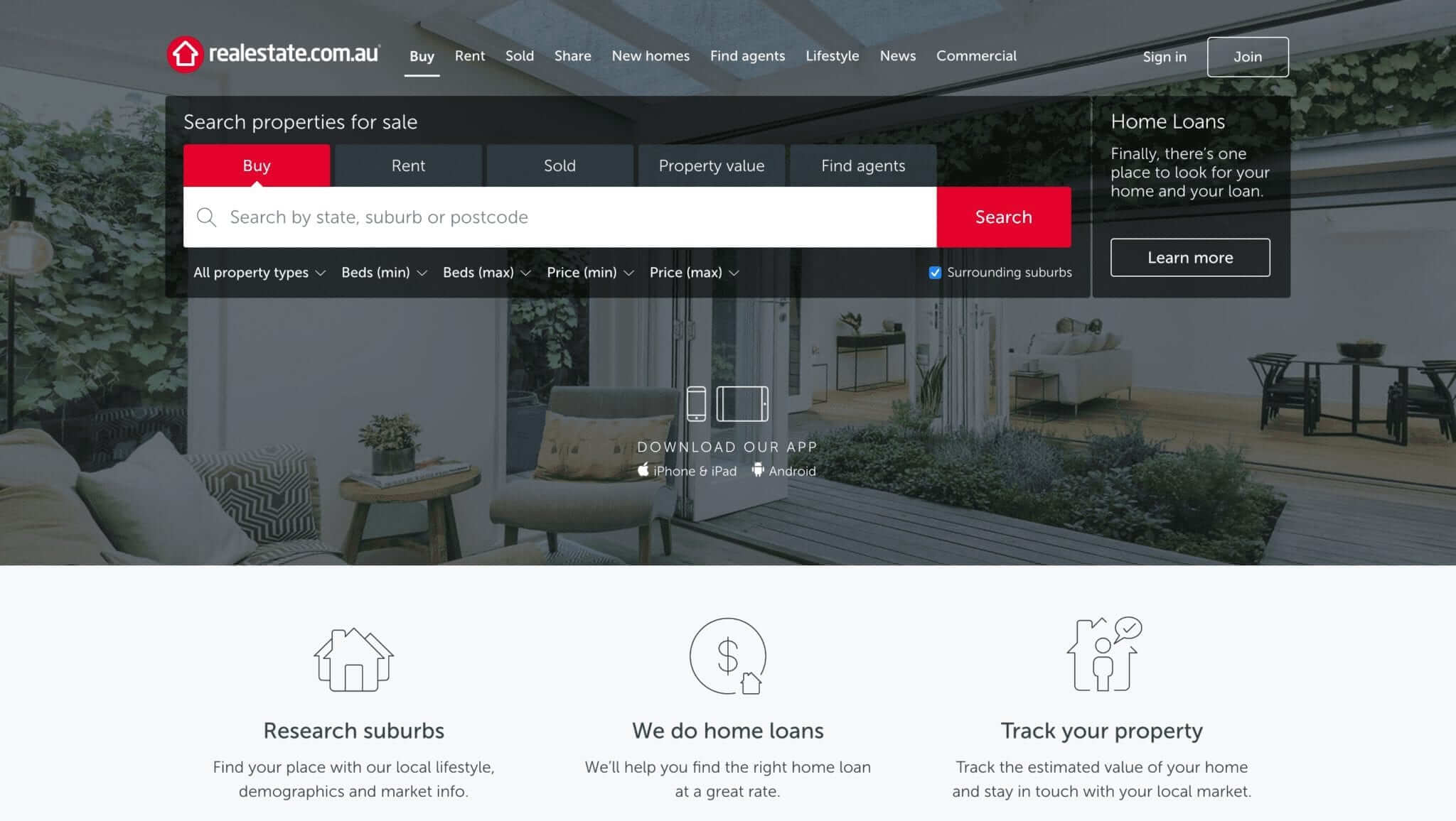
Considered to be the largest real estate website in Australia, RealEstate.com.au has taken advantage of visual and functional elements in their web design.
Impactful, suggestive, and attractive, the landing page greets visitors with a range of options highlighted by an unassuming call to action (CTA) to Buy. The Home Loans button is an enticing section with a clever subheading to engage visitors who can be granted loans and become interested to learn more.
Focus points such as the logo and CTA are highlighted in red that immediately stands out to catch the reader’s attention and people are easily drawn to download their mobile-optimised app.
Website: https://www.realestate.com.au/
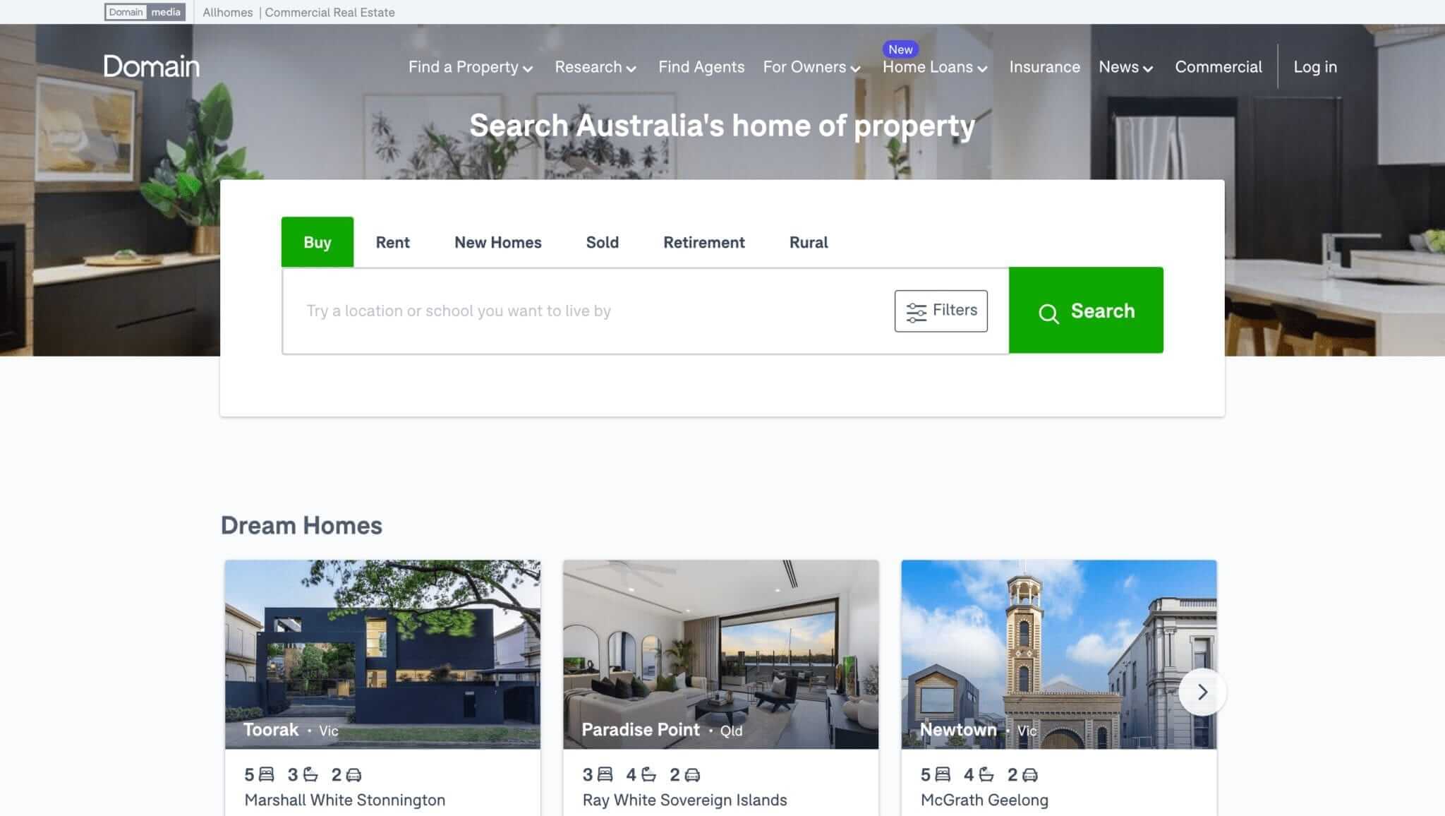
Domain.com.au takes advantage of minimal visual designs and graphics in its landing page to draw focus on its CTA to search and buy.
The website’s design simplicity complements its straightforward and eye-catching content that hinges on a consumer’s need to explore, buy, rent, or sell a property.
It leverages on emphasising an enticing price-point for the budget-conscious providing attractive locations and the number of available listings as its unique selling proposition. It also draws the reader directly to attractive menu drop-downs such as an emphasis on a Home Loans option and other key selections that would appeal to those looking for their ideal real estate property choices.
Website: https://www.domain.com.au/
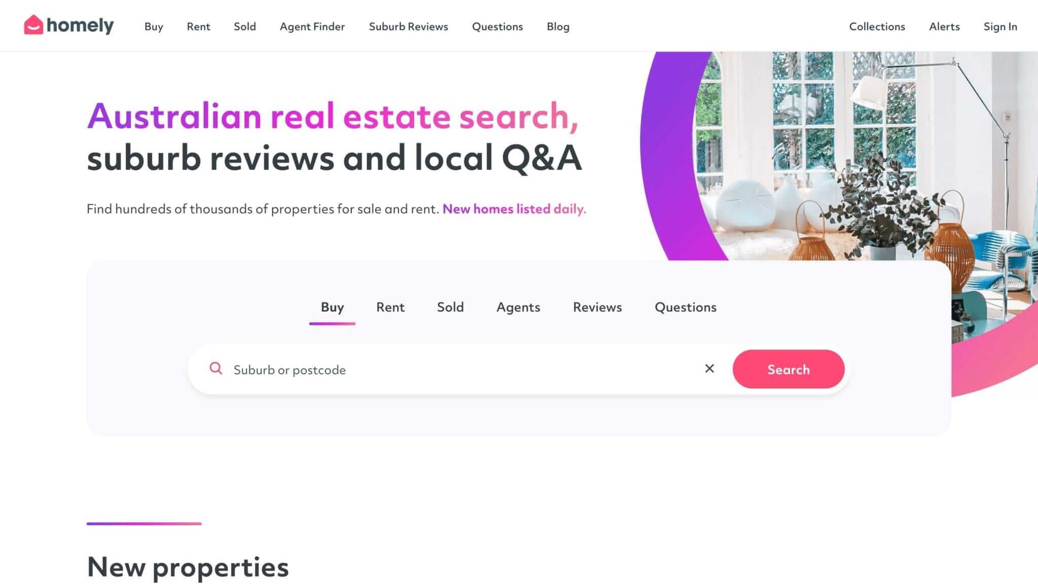
Homely delivers content to the Australian real estate market with its direct and straightforward design using minimal colour combinations against a white background with clean above-the-fold content.
The search field is strategically placed at the centre to attract visitors to type their property location queries. Furthermore, all the buttons at the top are drop-down menus. This also contributes to the clean look of the landing page.
The site does not openly sell other products like home loans, insurance, and offer your data to other commercial entities like some other sites. It aims to give visitors what they want in real estate such as their area of choice and an agent who can provide a featured listing.
Website: https://www.homely.com.au/
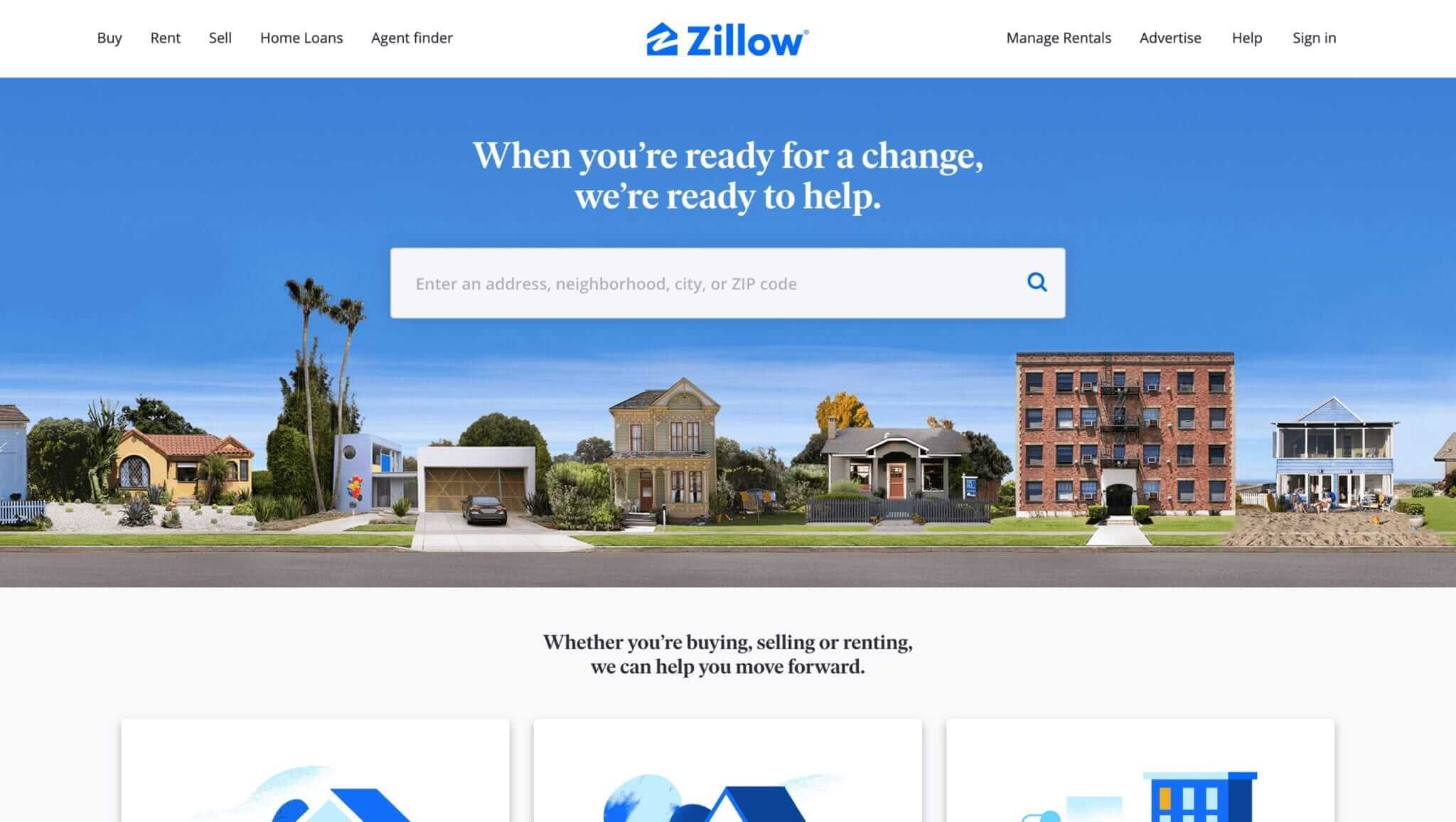
Zillow provides a wonderful design for people looking to do some home searching. It’s easy to use interface makes it intuitive and straightforward.
The search bar is configured to take a zip code or a broader search by county, plus search options can be customised using filters. It can cut down on time swiping through homes and provides full information on all listings.
It’s good to see homes around me that are for sale and how much they are selling for. Many have used the website as it aims to let friends or family look for a home to buy and check out. There’s a lot of information about homes with good quality pictures.
Website: https://www.zillow.com/
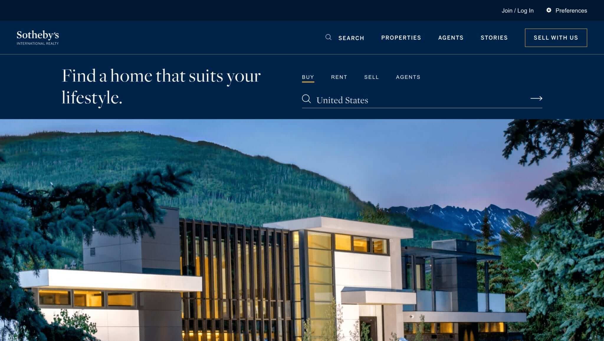
Sotheby’s gets you to their landing page with high-quality photos and videos of properties. Readers are entertained with immersive drone clips of island properties and stately, luxurious listings in it’s international network.
The main page has a limited filtering search of six options and the general filter lets you choose between its network of offices and associates. Scrolling to the bottom of the website pages, the footer contains four additional searches: More Luxury Destinations, Popular City Searches, Popular Lifestyles and Popular Destinations.
While most real estate commercial sites have more search filters, it should be noted that in the luxury real estate business, buyers have the financial means to have the agent do most of the filtering for them.
Website: https://www.sothebysrealty.com/
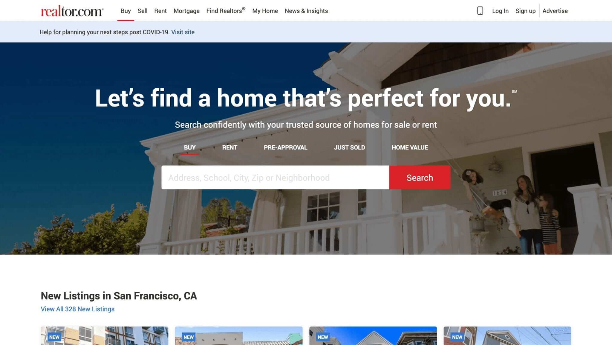
When people buy a home, they don’t just move into the house – they also move into its neighbourhood. Realtor is one of those real estate companies that work in highly desirable places that capitalise on this by showcasing areas on their website.
This design type features big, crisp header photos that persuade the potential buyer of finding the perfect home in a desirable area or locale.
The page keeps the theme consistent with a colour palette of blue and shades of grey without losing the upscale identity it communicates through appropriate fonts in its headers.
Website: https://www.realtor.com/
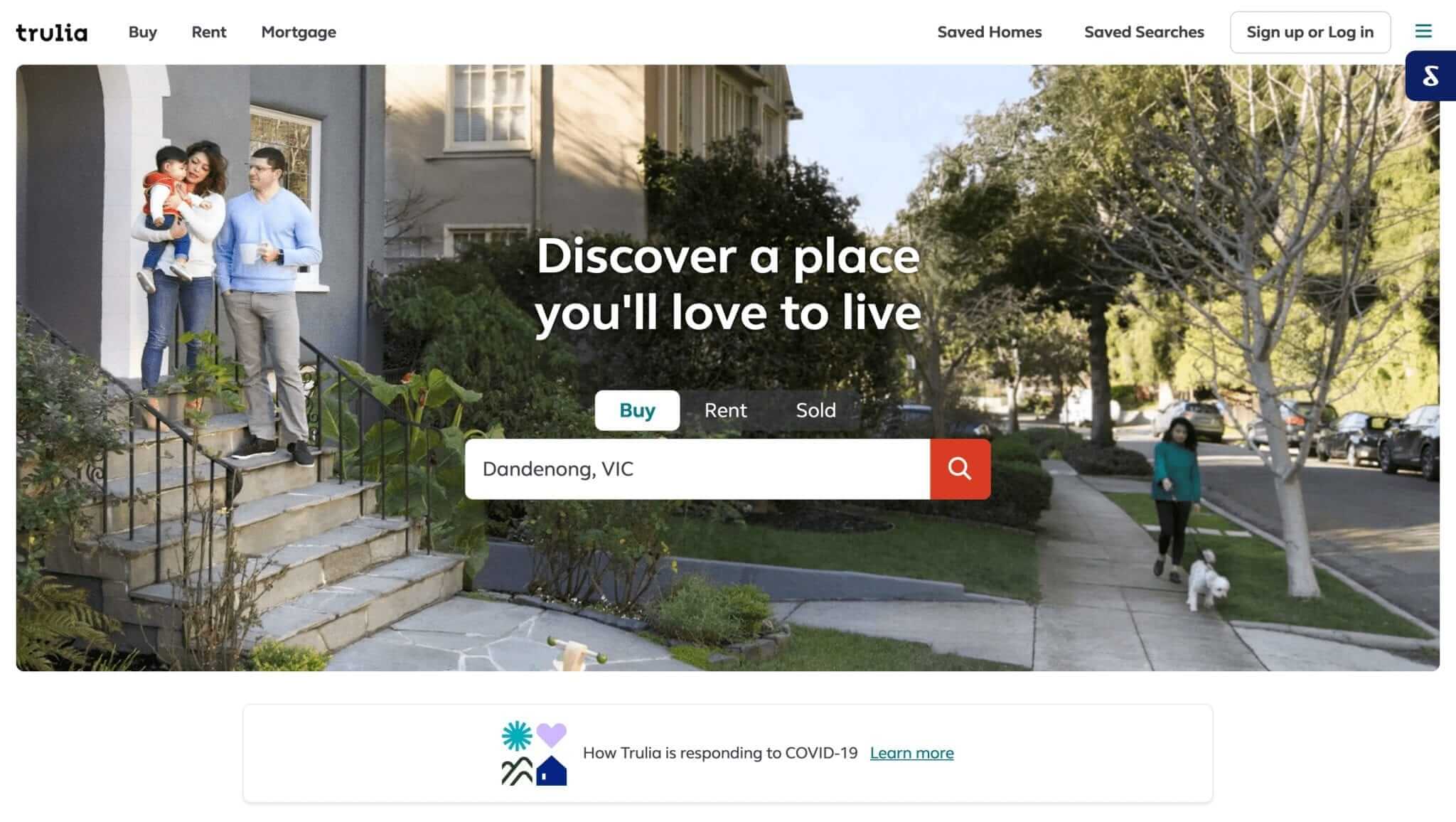
Trulia is a trademark of the Zillow Group and their design type is ideal for a brand that’s selling experiences, such as a vacation rental website or a roommate directory aimed at young professionals moving to a major city. When the lifestyle offered in an area is just as important as the actual real estate setting, an effective website shows it off and flaunts it.
Location is key for many real estate clients – not just the specific city but the neighbourhood and right down to the block. With this in mind, many real estate websites make maps their focal points, showing visitors precisely where each property is located and what it’s located near.
Website: https://www.trulia.com/
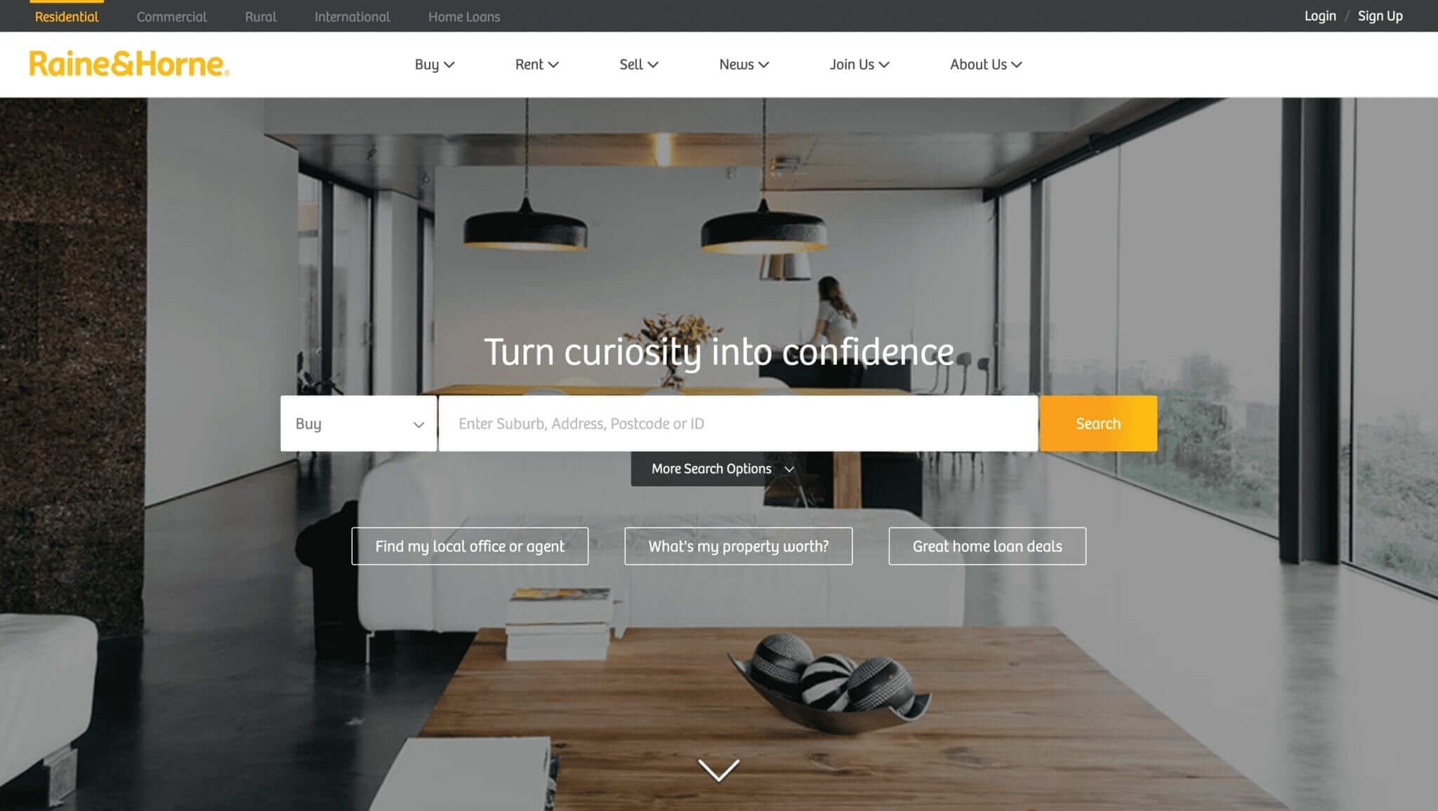
This website features images and videos to communicate about real estate to its audience. The landing page features a moving photo gallery of a contemporary house with fine interiors.
The images allow visitors to get to see everything they would want in a house. There is a wow factor that inspires users to find similar houses on this site.
They offer a unique selling proposition with their proprietary app called Amplify that serves as a powerful and search marketing AI-driven tool to sell and lease homes. There are also buttons on the navigation bar that allow users to have access to real estate information.
Website: https://www.raineandhorne.com.au/
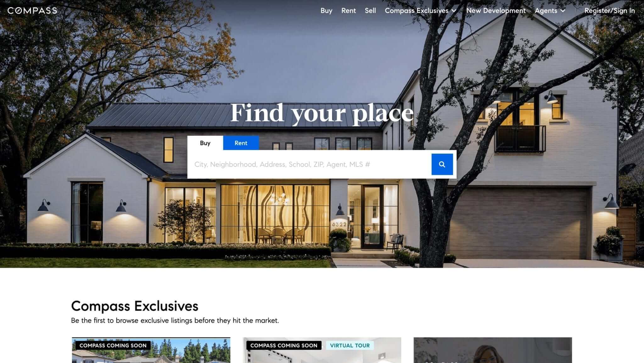
While Compass is a large real estate network it was able to tone down the intimidation factor by designing its website with approachability in mind.
It uses image colours for its website with an open-feeling, that is clean and bold. The lower page is dominated by high-resolution photos of beautiful homes with prices presented in bold and labelled as Compass Exclusives.
The theme is repeated throughout the page, invoking images of multiple lifestyles and home styling options in upscale communities. Site visitors are also encouraged to take the next step by searching for more options by clicking on the View All Compass Exclusives button.
Website: https://www.compass.com/
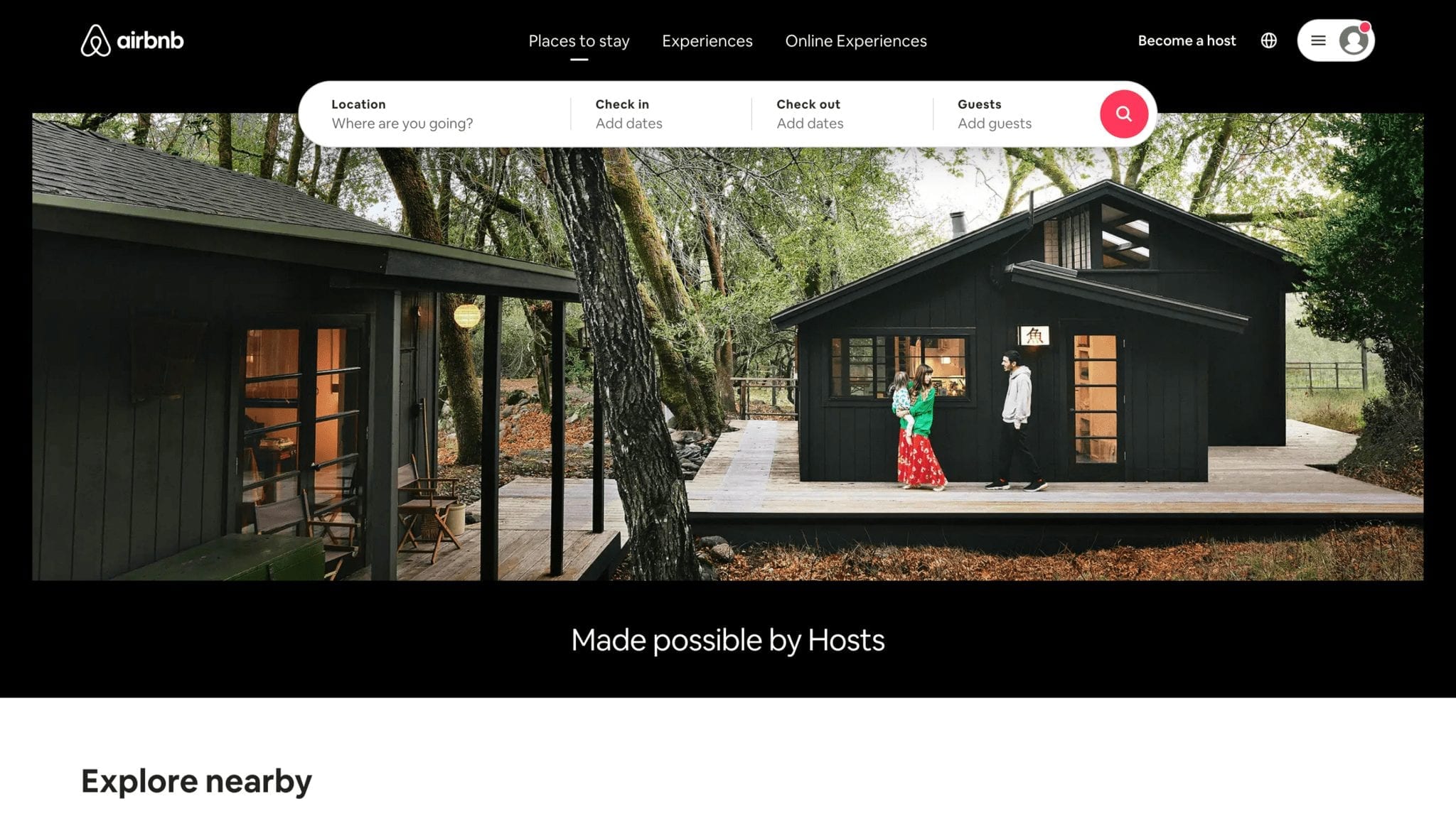
While airbnb is not a real estate agency, the rental and booking giant has been a global leader in the market for many years and has still not met its match in the thriving global industry – and there is a lot to learn here about searching and displaying property (design inspiration for real estate websites can come from the most unlikely of places!).
A huge part of that success is driven by an ongoing effort of its website design team to create a user experience for its booking platform that surpasses other similar services in the market.
The website uses colour contrast and shadows, while the user interface is structured as two layers. The card contains the explanatory text and the Call-to-Action (CTA) button that form the upper layer, while the rest of the page is perceived as the background layer.
With very minimal effort, site visitors can easily identify the upper layer as the area where they can easily interact.
The entire page does not overwhelm readers with information, thus establishing a clear interaction path for users landing on it.
Website: https://www.airbnb.com/
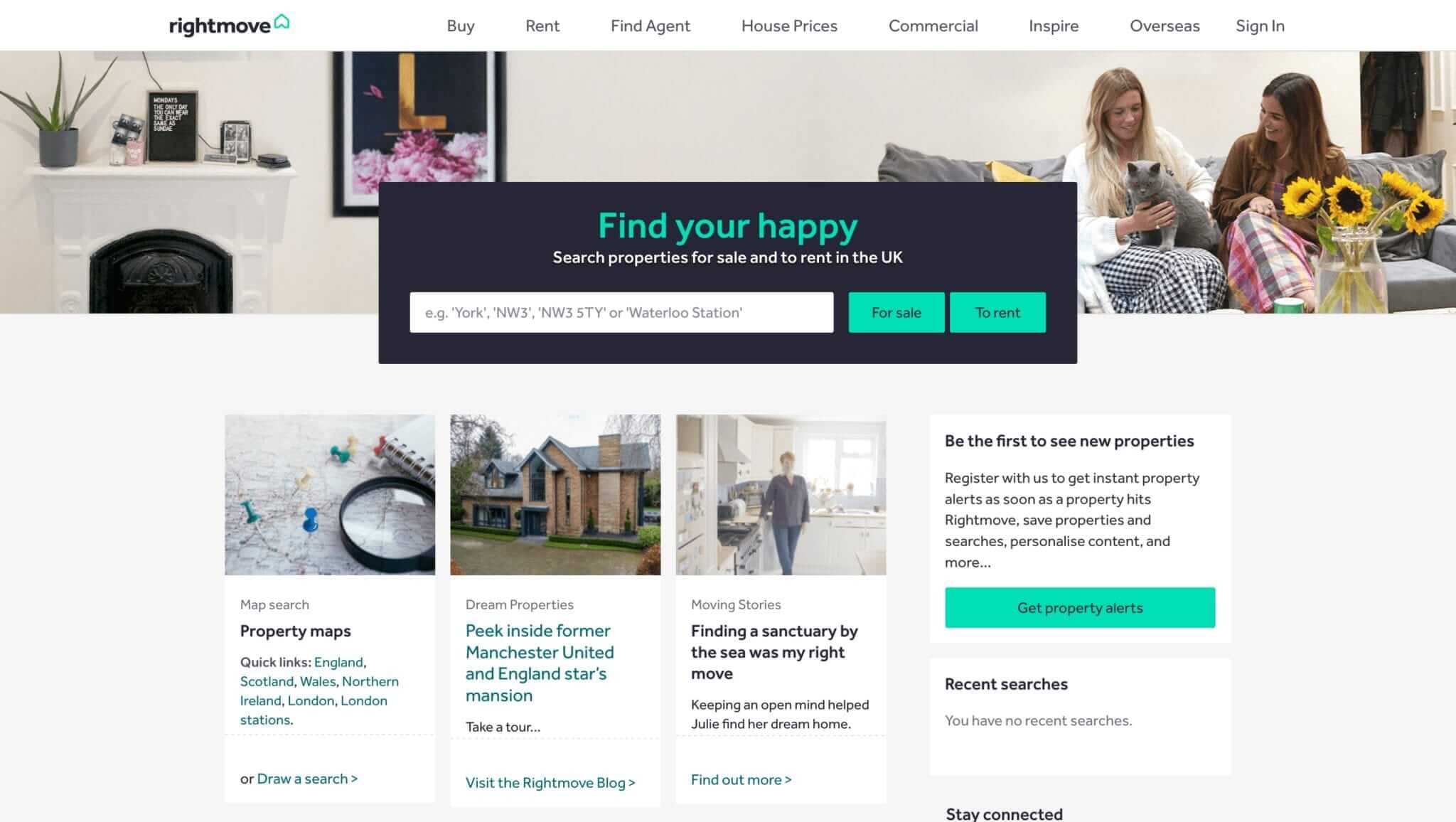
The landing page for Rightmove provides a striking yet simple design that highlights a message aimed at enticing viewers to explore for rent and for sale properties.
The minimal content on the website makes up for their direct approach to allow visitors to explore the website right away and show them around so that they’re pumped up to visit a property in person. The images and text are emphasised with the white background and make the visual elements stand out more visible at first glance.
They also use maps to show viewers exactly where listed properties are located, down to the block.
Website: https://www.rightmove.co.uk/
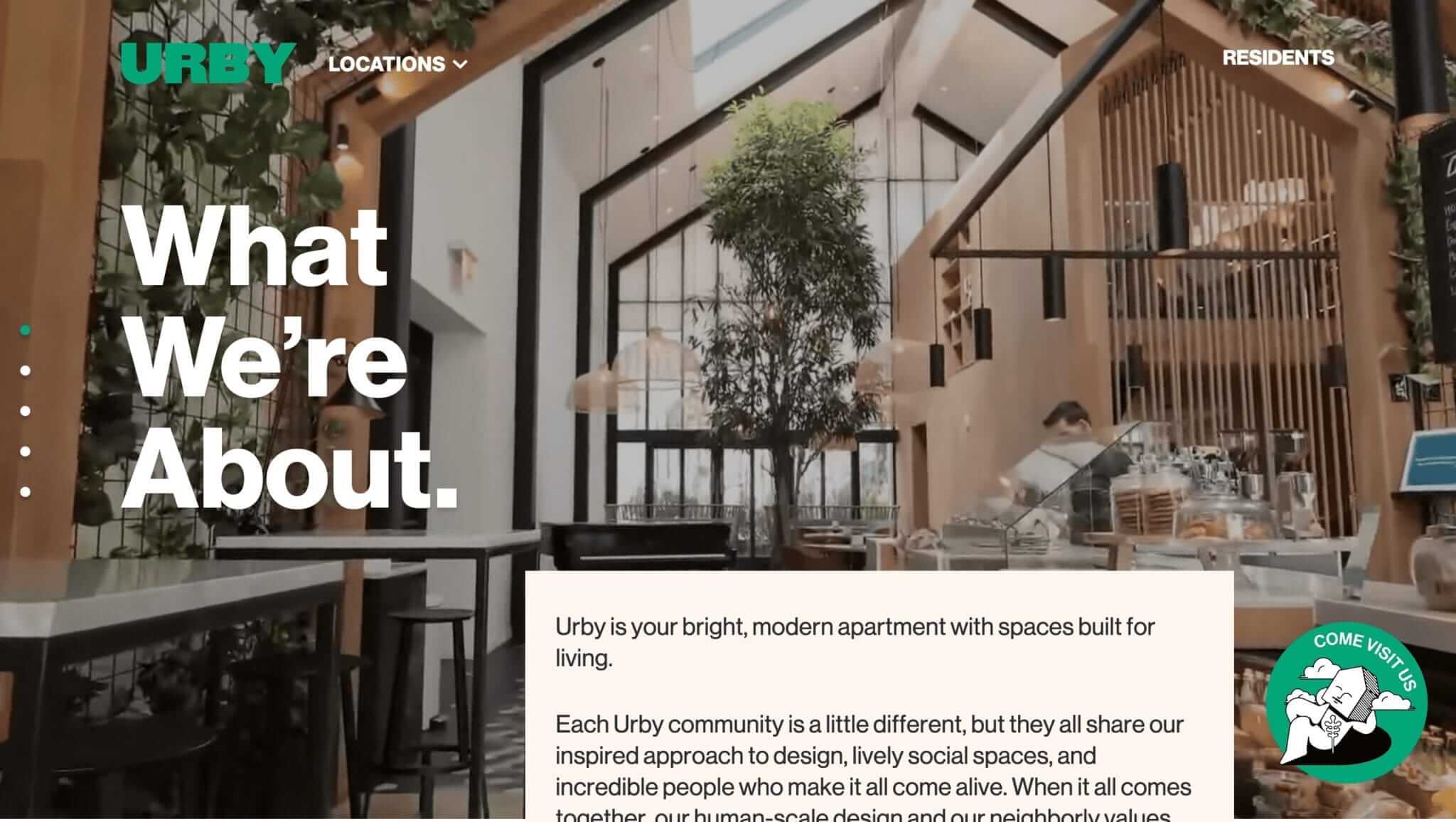
The modern website design for Urby takes the reader to an immersive and entertaining high-quality video presentation of an urban home interior and style that speaks for itself other than the text description that details the Urby brand.
The entire page is designed with bold and striking dark grey font types that are emphasised further by its blue-green thumbnails and links.
While the site may appeal to the luxury real estate market, it beckons visitors to visit the site in the form of a static CTA button that remains steady while the reader scrolls down the page.
With its clear messaging and easy-to-read texts, the site is a good example of beauty, class, and functionality even in design simplicity.
Website: https://www.urby.com/
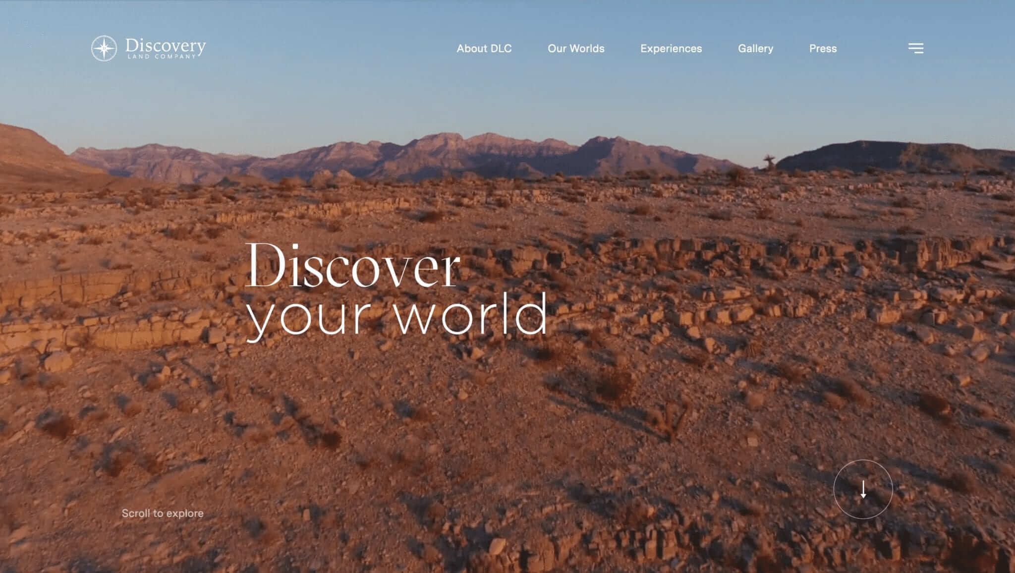
The landing page immediately takes the visitor to a varied combination of stunning and mesmerising videos showcasing captivating vacation and recreation hotspots that tells the story of the Discovery Land Company brand.
One of the amazing hooks for the site is that it captivates readers to watch through the well-planned videos using quality drone shots and video galleries with very minimal text elements on the headers and banner and inviting visitors to Discover Your World.
The design concept invokes action, adventure, luxury, and a variety of lifestyles that appeal to modern-day property investors, vacationers, and prospectors, sparing no expense to make their website spectacular and inviting.
The page also highlights experiences as a major selling point that is showcased throughout their website design.
Website: https://www.discoverylandco.com/
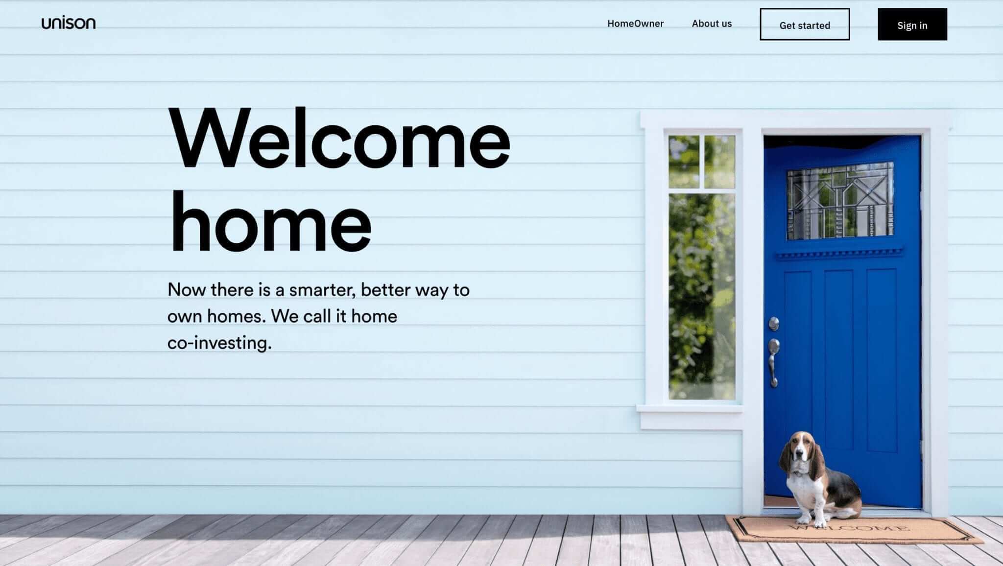
A simple yet impactful website design that draws its appeal to homeowners and property investors looking to find the best properties and at the same time offering a way to make homeownership more attainable through co-investing or cost-sharing.
The main image invokes a homely feel featuring a still image of a powder-blue home exterior with a pet dog and a partially-open main door subliminally beckoning site visitors to go ahead and take a look.
The drop-down header options are cleverly composed such as selections to Pay Off Debt, Renovate Your Home, Success Stories, etc. The CTA is well-placed with a border placed around the Get Started link.
Another hook for the site is its bold emphasis on the running amount of accumulated property values that the agency has been involved with and video testimonials of happy and satisfied clients.
Website: https://www.unison.com/
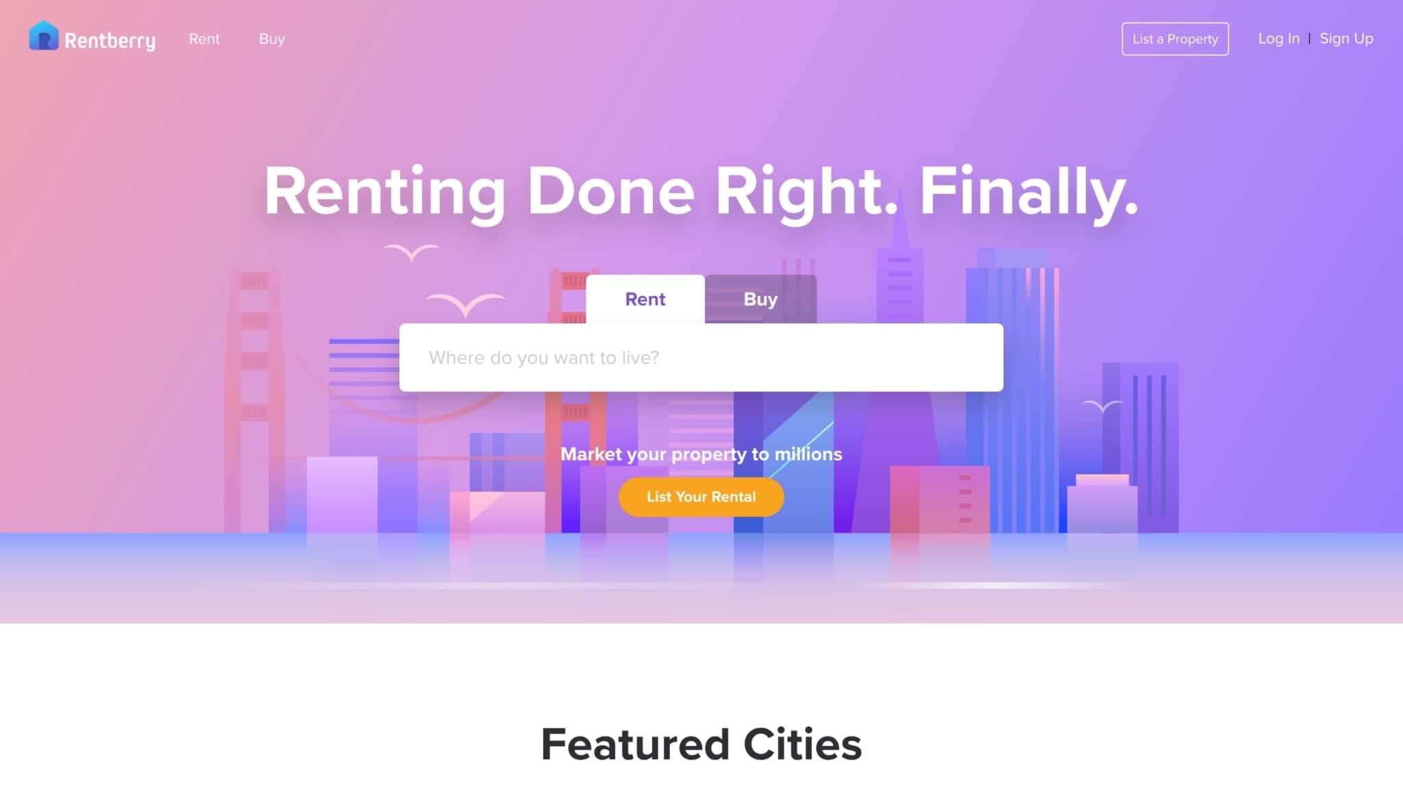
The site promotes the benefits of renting on its main page with its main CTA to search for the best rental options available in your selected area.
The banner conservatively provides options on its drop-down menus located in the upper left corner of the page beside the logo and business name to Rent or Buy, with the main message for visitors to try and enjoy their concept of Flexible Living.
The middle of the page shows links to its nine global locations for their rental property listings and announces its upcoming target locations to add to their rental property portfolio.
To make their page more responsive to their visitors, Rentberry highlights 360-degree virtual tours of their rental property listings and makes it more convenient for clients to sign essential paperwork online from their homes through its eSign option.
Website: https://www.rentberry.com/
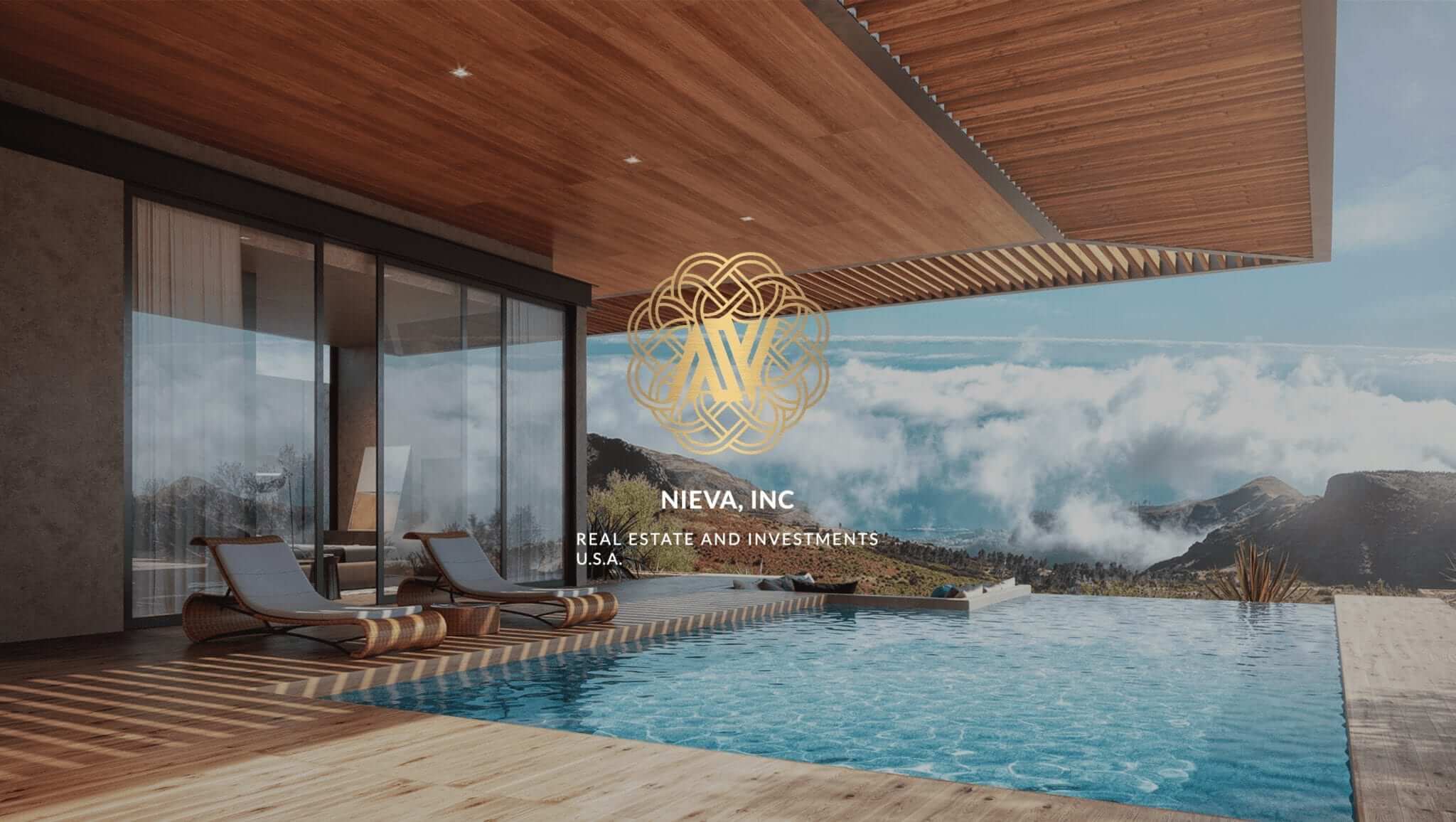
Nieva showcases its main page with a magnificent house with an infinity pool and lounge set in a picturesque backdrop of hills and clouds.
As visitors scroll down the page, they get to see everything they need whether commercial, international or residential properties with wow factors that inspire readers to find similar houses on this site. It also provides a visual gallery of featured luxury projects such as the Aston Martin Residences to attract discriminating clients.
The text content throughout the page highlights the profile of the agency and listed property options and allow users to contact Nievan through a form provided at the bottom of the page for queries.
It also features reviews and feedback from satisfied clients to add more credibility to the brand.
Website: https://www.nievainc.com/
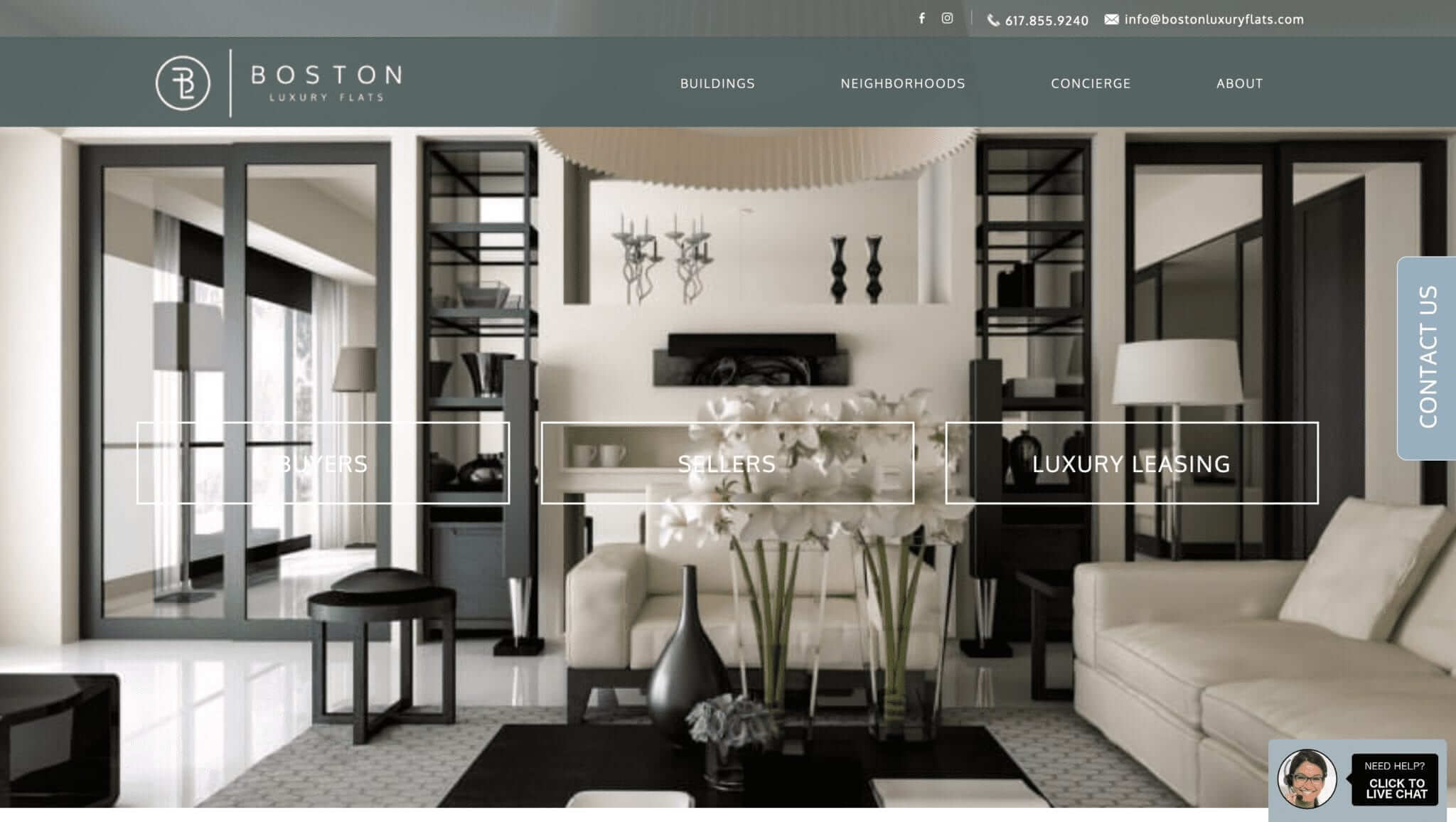
Website designs that give viewers virtual walk-throughs are perfect for real estate agencies that specialise in luxury homes and rentals.
The design for Boston Luxury Flats accomplishes this by putting the viewer inside a property or a home immediately when the site is loaded and places the viewer right in the strategically-placed areas where they can take in the window views of gardens, landscapes, cosmopolitan backdrops, and more.
The design also takes viewers on a virtual tour from the many international locations and property offerings. A pop-up chat-box allows readers to get in touch with agents via chat and if no agents are available, an email field is provided at the bottom of the page for visitors to leave a message or send their inquiries then expect a response via email.
Website: http://www.bostonluxuryflats.com/
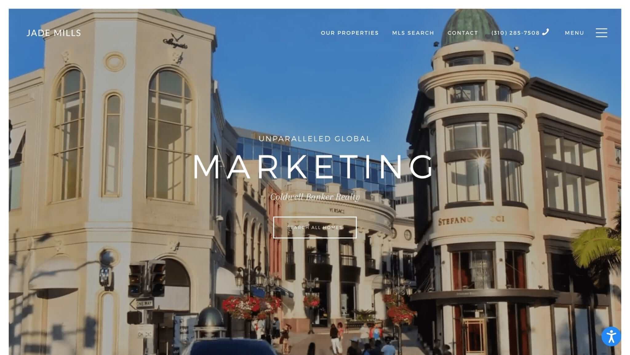
Visitors are immediately transported into the online world of luxury and opulent real estate for Jade Mills Estates as they are greeted with a regal black background followed by drone shot videos of high-end properties, luxurious automobiles and retro structures, and ends with a skyline view of a bustling and magnificent metropolis.
The landing page communicates their brand message and as readers scroll down, they are greeted with a transitioning image gallery of Jade Mill’s featured listings with sale prices ranging from $29m to $79m.
The CTA link to Search All Homes is highlighted at the centre of the page and the bottom right corner of the page is an icon link for Accessibility Options to allow visitors to filter options based on their accessibility profiles.
The page design spared no expense in providing visitors with an immersive and virtual visual experience with links to their serviced locations, blog content, and high-quality video presentations showcasing their expertise in the luxury and high-end real estate market.
Website: https://www.jademillsestates.com/
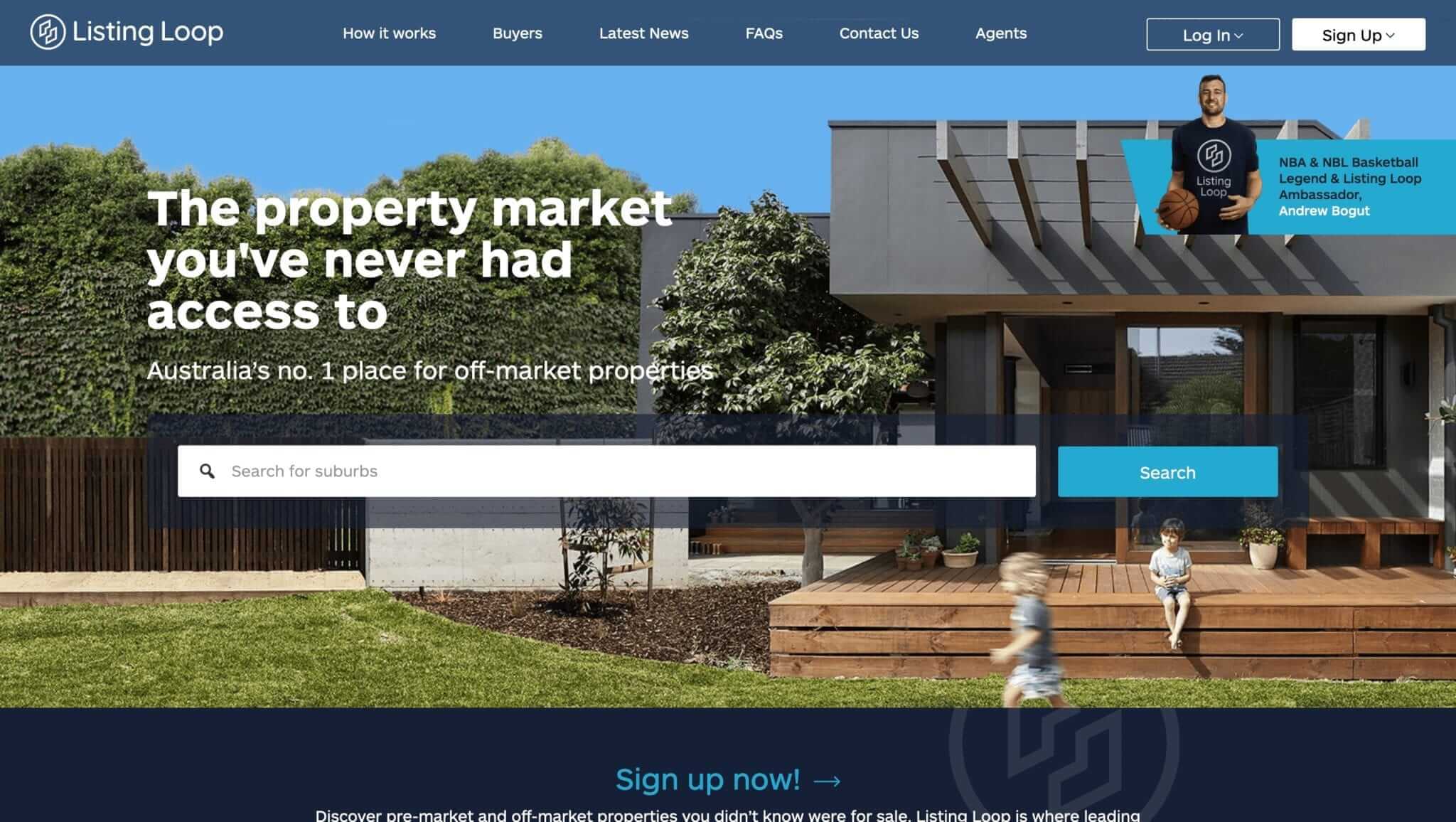
The Listing Loop website successfully connects with a unique real estate market segment focusing on pre and off-market properties in Australia.
The site uses bright and inviting blue, grey, and earthy colour combinations to strike its visual appeal to readers. It also adds a human element into their design by highlighting a sports celebrity as their brand ambassador to add credibility and integrity to their site, as well as the image of a child sitting on the front porch of the featured property image.
By offering CTA’s that help guide readers on how their process works on the header dropdowns along with news, updates, FAQ’s, contact channels, and more, the design makes the site responsive and functional for site visitors.
Website: https://www.listingloop.com.au/
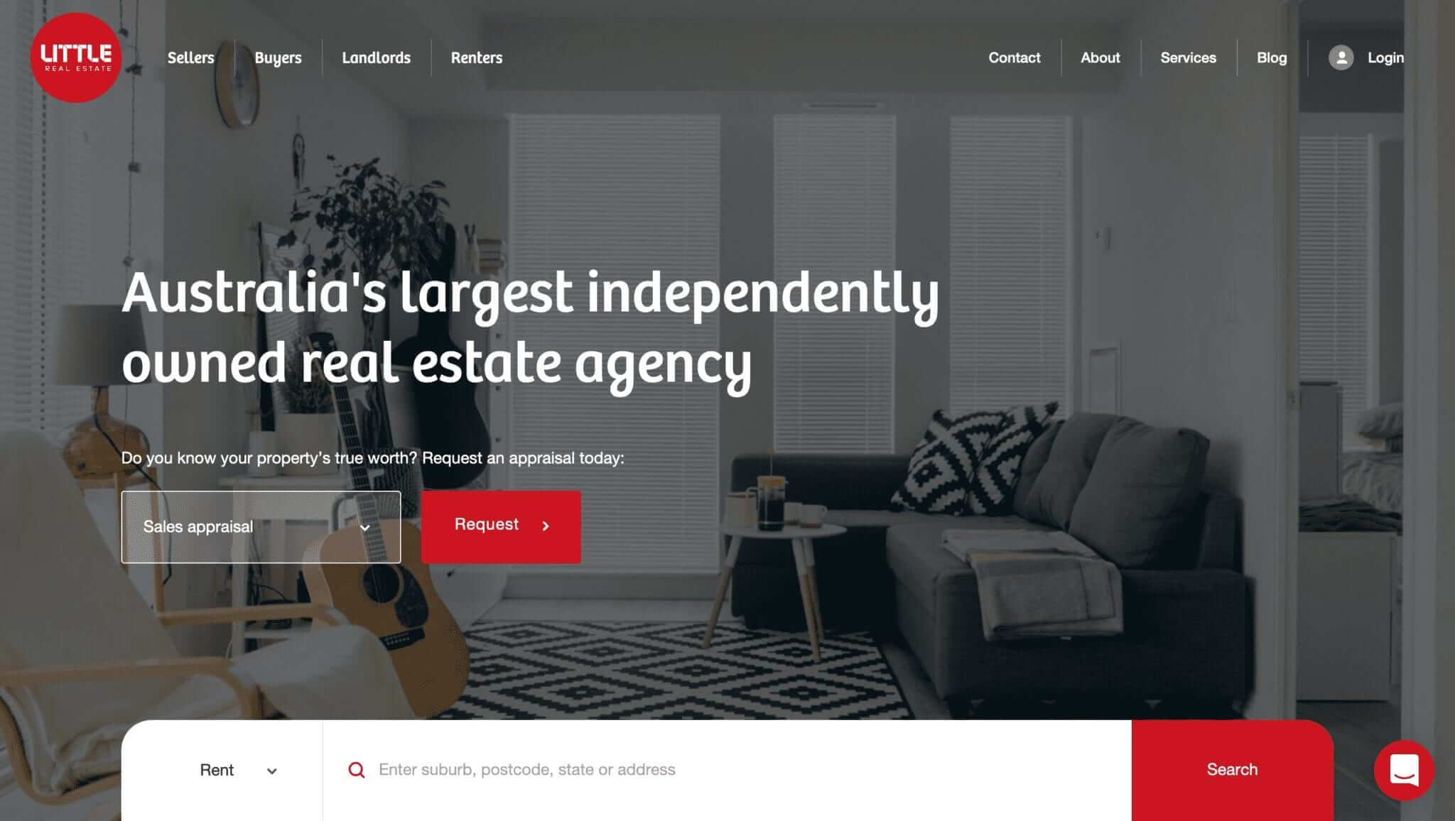
Little by name, big and bold on their website design: Little Real Estate’s website design uses a more straightforward and contemporary approach for visual appeal to its visitors.
It features an urban yet homely apartment vibe that touches on a slightly laid-back home and lifestyle. As a catch-on, the site’s CTA beckons visitors to request a property appraisal with options to buy, sell, or lease.
While the static images help convey the brand’s message, it makes up for the site’s functionality with simple filtering options to buy, sell, or rent.
The page also has features industry-related articles that can help potential home buyers, sellers, and property investors make the most out of their real estate journey.
Website: https://www.littlerealestate.com.au/
There’s so much inspiration out there, it can be hard to know where to start, but we’re here to help
We work hard to help you make your new real estate website perfect for your needs
You’ll get 2-3 branded concepts of your chosen design to help visualise your brand
Have inspiration from one of the above 20 websites? Talk to our team to discuss options
Take the first step towards real estate website enlightenment by getting in touch below or calling us on 1800 432 742
Need help? Let’s talk!
1800 432 742
Your journey to a beautiful new real estate website starts here! Let us know your details below and our team will be in touch to take you through the next steps.