Experience an amazing transformation on your real estate website with practical yet simple staging tips that will surely optimise your listing presentations.
Real estate agents will agree that properly staging a home can bring out the best features of a house and help the audience visualise and imagine how they would fit into the picture. Staging isn’t about filling a house with furniture, but more about giving potential buyers a better idea of size, scale and that the home can definitely have that lived in feel.
The first impression is always lasting
Staging a house or property is not just about simply showing it, the idea here is to boost your chances of getting noticed and entice audiences with a dash of creativity and proper planning. Just as you would with home staging, marketing yourself and your products follow a similar concept, especially in website design.
Maintaining quality and giving it your best through your website is relatively the same when staging a house since you are carefully organising the best set of visually appealing images to communicate positively and generate equally good emotional responses.
Your website reflects your brand
As mentioned before, your website is a reflection of your professional image, think of it as your online shopfront, business card and profile all-in-one. While a real estate website is generally a two-dimensional platform, you are not bound by its limitations and in fact, it allows you to take advantage of its opportunities to showcase your staging abilities and creative skills.
Having a website allows you more freedom and versatility that could present your audience visually enticing content and amaze your prospective clients.
Create stunning images to maximise visual impact
Today, images are more than just pictures. It has become a potent and powerful communication tool in digital marketing and web design. You can entice potential clients with your high-quality pictures that greet them when they visit your website.
Take advantage of all your most impactful photographs that highlight your focus areas and the best assets of your property listings. You can also make the most out of good quality lighting to accentuate these remarkable home features.
To effectively capture your audience you could narrow down your photo choices to reflect only those that are essential to them, especially when designing your main hero or banner photos. Lining up all your best images in a slideshow with a good mix of interior and exterior shots such as your neighbourhood as a backdrop or some unique and interesting architectural designs and details.
Artfully craft a picture of the local scene
By providing your audience with a thematic concept and presentation that reflects the vibe of your locality can impress and entice your clients. Your ability to paint a picture that communicates well such as a cosmopolitan and corporate vibe or a rustic and cozy setting can help you connect better with your audience.
Play around with colours, decorative accents, and textures in your website design to complement your stunning pictures such as drone shots that show an eclectic mix of natural and man-made structures that make the area look more appealing and attractive.
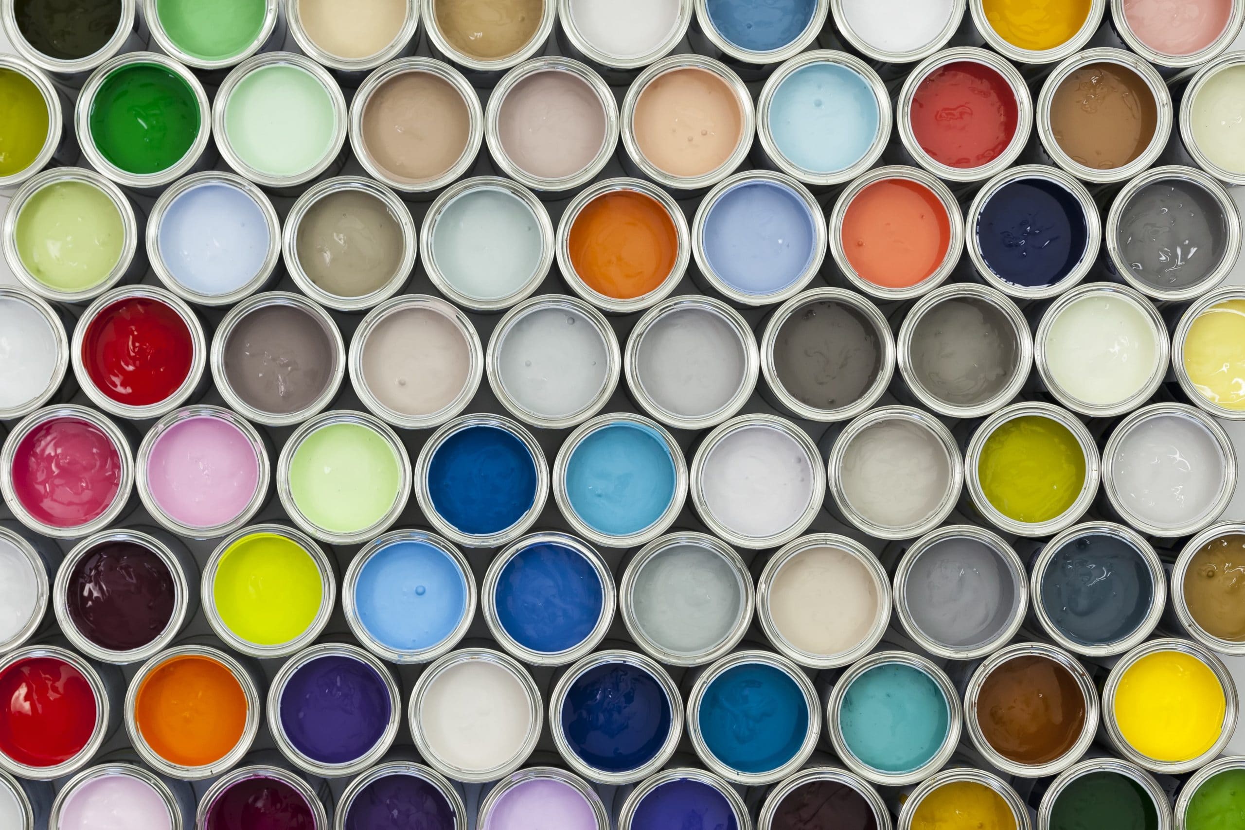
Communicate with colours
Whether you are going for a minimalist or maximalist design approach, using colours can greatly help add more character to your website design. For example, it may be important to incorporate coastal and bright colours if you are showcasing property along the Gold Coast, or forest greens and subdued browns when presenting a mountain listings.
Stir up inviting and warm feelings
Adding your personal touch to your website can make you more relatable and inviting to prospective clients, especially when you are in the business of selling or buying homes.
This can easily be done by choreographing your images with happy families or people having fun inside and outside the home.
You can also provide compelling and inspiring captions to give inspiring descriptions of property features that would take them on a virtual tour of the property presented.
Be attentive to details
Take advantage of psychology and marketing strategies to consistently reflect your image and story in details that matter such as impactful thumbnails, button designs, call to action buttons, etc.
It gives your audience the impression that you are keen on fine-tuning details and helps build your audiences’ confidence in you are their go-to guy.
Never underestimate the power of good content, which is why proofreading your content carefully before it gets published can be a powerful indicator of your professional conduct.
Do not overcomplicate; keep it simple
Avoid overwhelming your audience with a lot of information and images that could drown out your objectives. Similarly, avoid going overboard with your design elements and concepts by keeping it simple and reader-friendly.
When using full-screen images, you may want to incorporate a little white or empty space around it, instead of bunching it with other pictures. Having too many images also slows down your loading process and could do more harm than good.
Not sure how to always find the right balance when planning your website content to generate the most impact on your audience? Contact the team at iDashsites, and we can help guide you with a beautiful new real estate website design for your agency.


